
Peter Dayton
Peter Dayton was born in New York City in 1955. He got a BFA from Tufts University, attended art schools in Europe in the 1970’s and finished with a degree and diploma from the School of the Museum of Fine Arts in Boston. While at The Museum School he studied video and performance art and started pursuing music as an art project. After art school, he pursued music professionally, first in the punk rock band La Peste, then under his own name. He got back into visual art in 1988 and began showing brightly-colored flower collages, using photocopied images from seed catalogues that referenced Pop Art and Andy Warhol. In the last several years he has been making paintings on vertical plywood panels that mimic the brightly colored surfaces of surfboards that critique and explore commodity culture.
Dayton has exhibited in numerous galleries in the US and abroad, including the Eric Firestone Gallery, The Leiber Museum, and Glen Horrowitz, East Hampton; the Parrish Art Museum, Southampton; Devin Borden Hiram Butler, Houston; and Morris-Healey Gallery, Los Angelos, Miami, and Basel, Switzerland. Solo shows include Winston Wachter, New York City; the Collective Design Fair, New York, NY; the Baldwin Gallery, Aspen, and the Drawing Room, East Hampton, NY.
He has also collaborated on numerous commercial and residential projects with the architect Peter Marino, including the elevator interiors in New York and Los Angles for Chanel and many other projects for Chanel boutiques worldwide. Dayton’s works are held in several private and public collections of Philip Morris & Co., New York as well as The Museum of Fine Arts, Houston, and Guild Hall Museum, East Hampton, NY.

“I have always been an artist. I know that because my earliest memories of school were of teachers who would bring it to my attention and tell my parents too. I always felt like I had to be making art.

I think my idea of art is different from a lot of other artists in that I express myself in a neo-pop sort of way and reference other artists while concentrating on issues of surface and beauty. I try to stay outside of it. I keep my hand out of my work too and frequently use found photographic images of flowers and the look of the Xerox as I print the pictures and degrade the image. My work looks to me more like signage or posters, and it  often has a commercial aspect to it that subverts the idea of fine art, yet strives to be beautiful and rewarding to the eye of the viewer.” — PD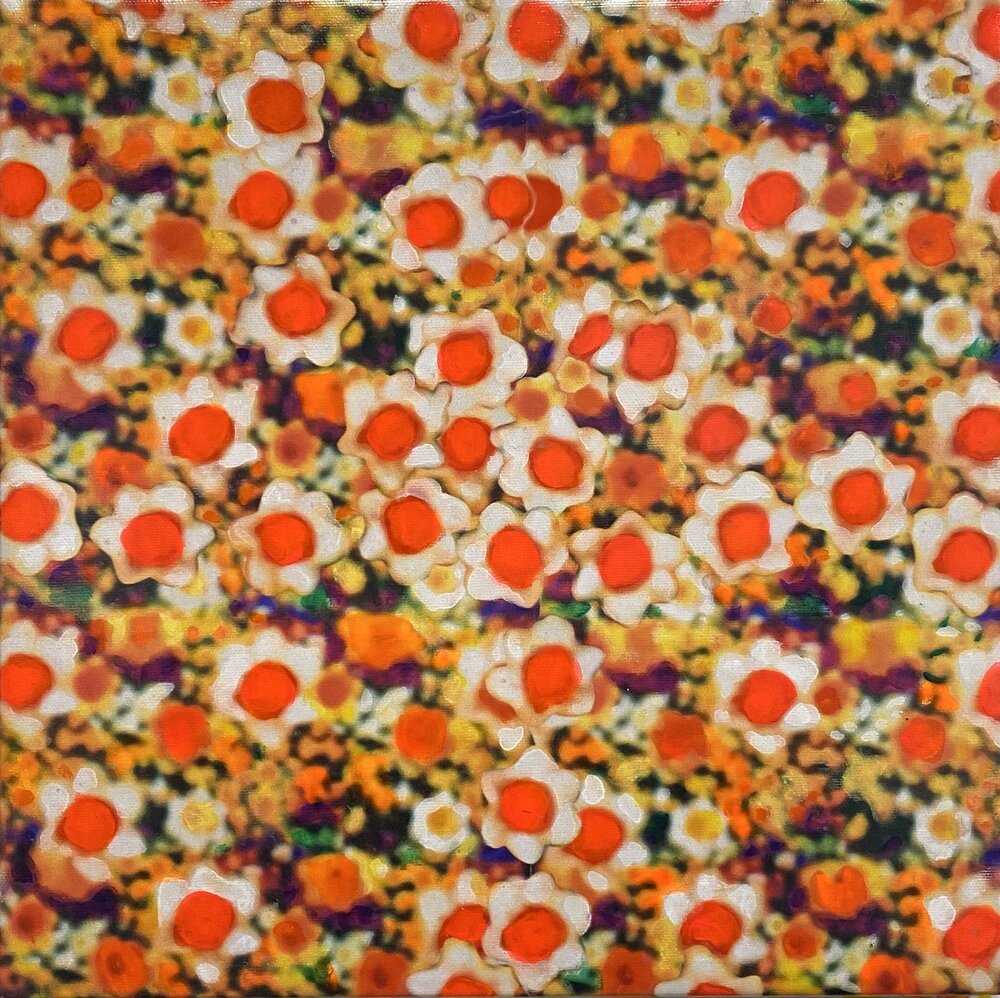
Day-Glo Daffodils 2019 acrylic over inkjet on canvas, 12" x 12"
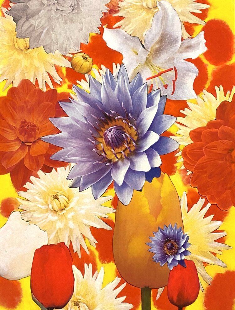
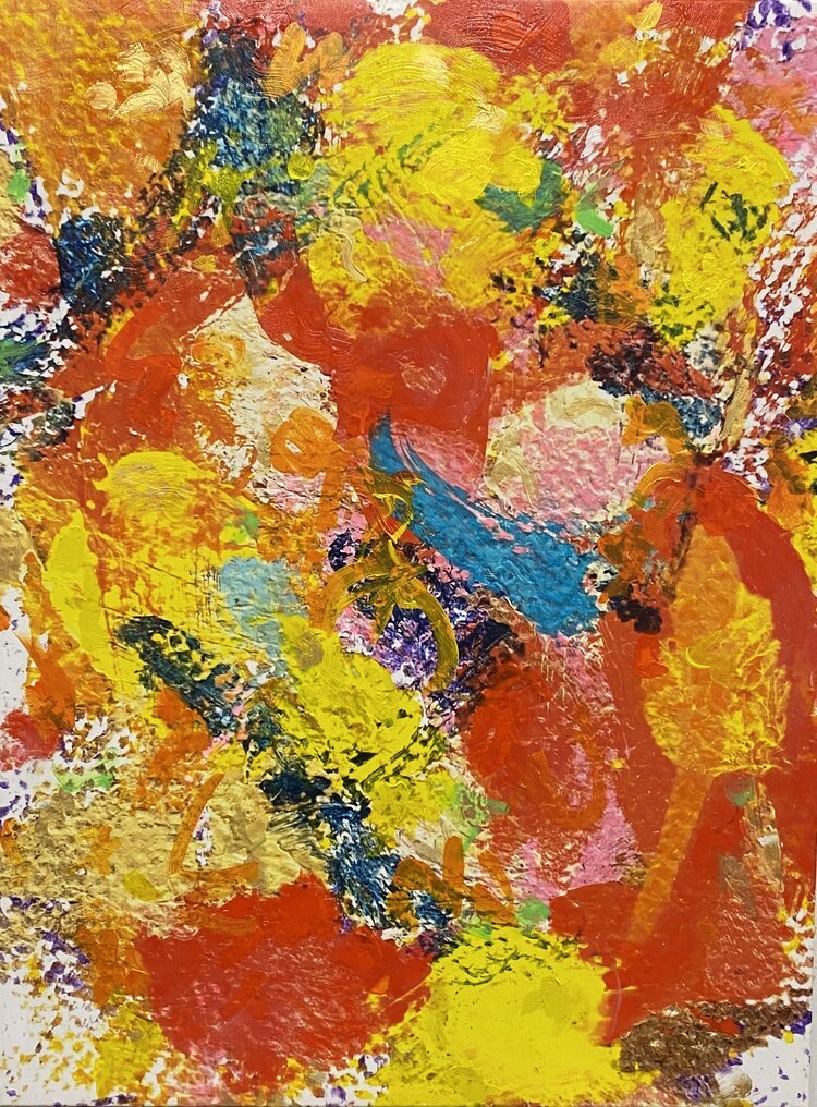
Wild World, 2020, acrylic over printed photograph on canvas, 30" x 24"
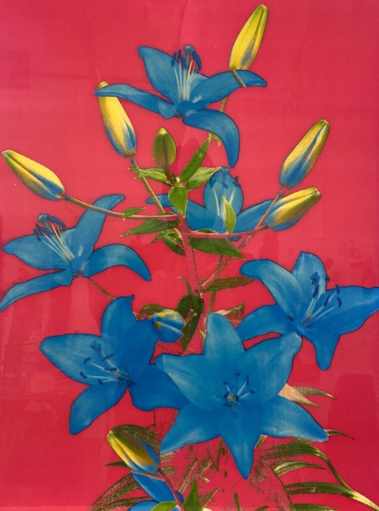
Untitled 2008 Xerox collage on canvas 24" x 18"
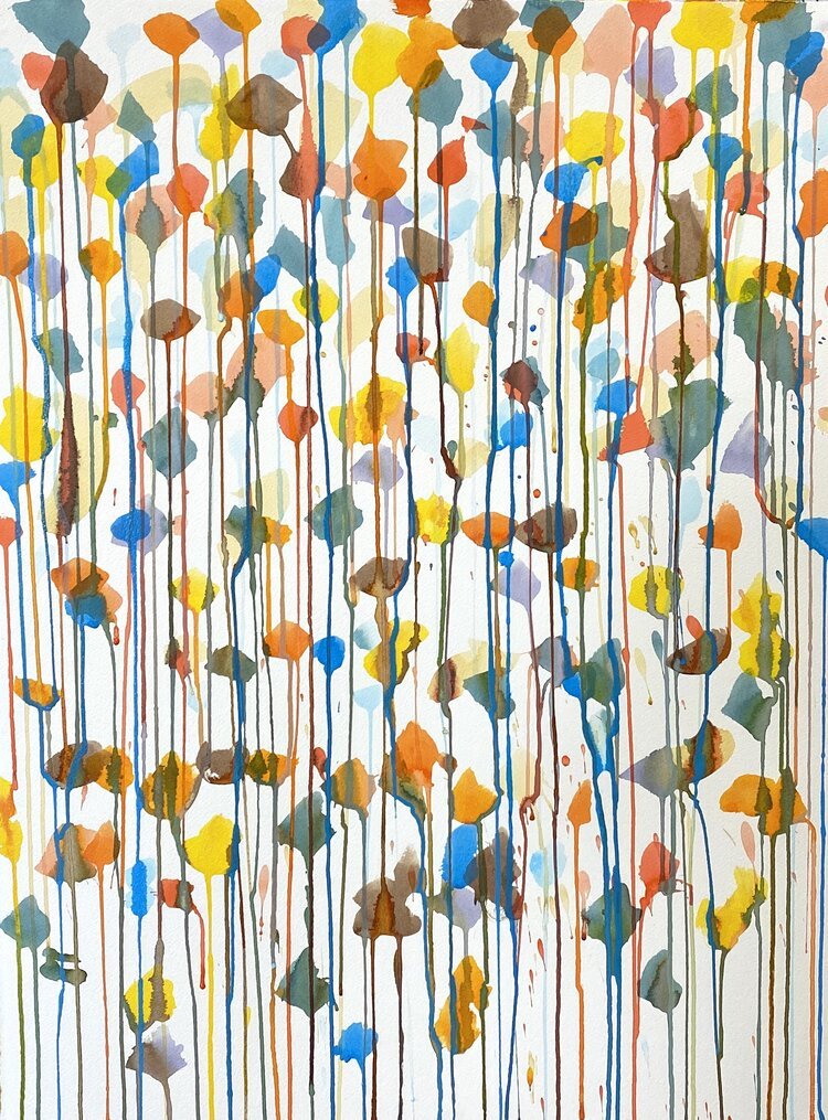
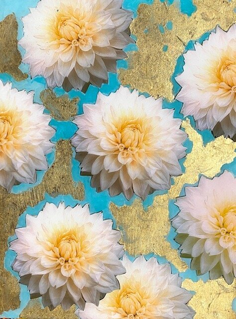
Water Garden, 2020, acrylic on watercolor paper, 30" x 22"
Fake de Kooning, 2020, acrylic and mediums over printed canvas, 40" x 30"
Dream World, 2020, mixed media on panel, 16" x 12"